Blog
The Fold!
October 16, 2018
Ladies and gentlemen, this is the fold! It comes from another era, the one where newspapers were the main information channel. An era where your paper had to stand out from all the others just to be picked up by a potential reader at their favorite newsstand.
Source: New York Times

What could you find above this fold?
When scanning for his pick of the day, the newspaper reader was expecting to find the following information above the fold: the newspaper identification, big and catchy headlines, a large image, and headlines of the top articles. Pushing the most interesting content above this physical fold was a way to catch the attention of the readers in the hope to sold more copies than your competitor.
Source: United States Library of Congress’ Prints and Photographs Division (ID: fsa.8d11969)

The fold’s evolution
Eventually, this concept evolved into the digital world with the arrival of websites. The fold is represented by the bottom of the computer screen. The content “above the fold” is what users can see before they must scroll down the page. What is under the fold was considered to be nonexistent, as it was expected that most users would not bother scrolling down. That’s why a lot of content got crammed in this first screen, resulting in websites that looked just like this one:
BBC News 2003 version

For a long time, the term “above the fold” sticked to the Internet world. Clients wanted their content – a lot of their content – to be visible above the fold. Websites were designed this way due to this pressure. Designers worked hard to try to change the minds of people, but the fold was omnipresent in discussions, and unfortunately these battles were not often won by the design teams.
A digital revolution
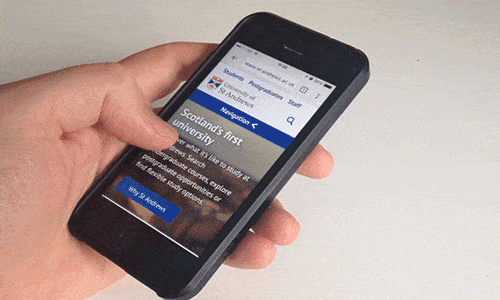
However, thanks to the birth of a new technology, the smartphones, and the way users interacted with this new device, designers finally got the break they were waiting for. The ease and the necessity to scroll down on these small screen devices, added with the fact that more and more people possessed smartphones, changed minds and helped scrolling to be adopted on other devices.
Tip of the iceberg

The propension to scroll down was transposed to desktop usage. Users now understand that what’s “above the fold” is not the entire website content, and by scrolling down they will find a lot more to explore – in particular when the layout makes it clear that more content waits below!
The omnipresence of social media in people’s lives also helped to change the perspective about the fold. What are you doing on social media? Scrolling, scrolling, scrolling. A majority of users is now fully accustomed to scrolling, In fact, they are scrolling so much that often they even start to do so before the page is fully loaded.

To prove it, test it!
Since this concept has been a source of discussion among the UX designers and their clients, some companies took the testing path to try to prove or disprove the relevancy of this fold. Testing it would bring quantitative data into the discussion.
Here are some examples of what has been found:
- 66% of attention on a normal media page is spent below the fold. (Chartbeat, Scroll behaviour across the web, 25 millions sessions analyzed)
- Huge inc. (Digital Agency in New York City) performed a user test session with 4 different types of web page design and 91% scroll almost immediately on page load no matter what (cues or not).
- Clicktale analyzed 80,000 page views to discover that on 76% of those pages people have scrolled and that 22% scrolled until the end of the page.
- The renowned Nielsen Norman Group (User Experience Research Firm) has previously noted in 2010 that 80% of user’s attention was done above the fold. From new user testing research (April 2018) they observed that 57% of the users’ page-viewing time was above the fold while 74% of the viewing time was spent in the first two screenfuls, up to 2160 pixels.
These are but a few statistics , and there are many more that can be found around the web. You can also take a look at the Museum of Websites and you’ll see the design evolution of various big brands like the New York Times, Amazon and Yahoo. Check for the latest version of these brands. You’ll notice there are bigger images. The design “breathes”. They no longer want to cramp everything up.
If you built it (well) they will scroll!
Even if we can say that scrolling will occur, something hasn’t changed: you still need to catch the user’s attention. This means that your content must be relevant and fulfill the user’s need. If your site doesn’t have that, the user will simply go away and won’t even bother scrolling further into your website. So, there’s no need to cramp the content above the fold like we were doing 10-15-20 years ago. Users will scroll through but we must give them a reason to do so. And if you read this current line, we’ve proven our point.
In order to inform more people about the state of the fold in 2018, go ahead – share this article…and let’s scroll!