Blog
Overloot: a Game UX Case Study
March 17, 2020
Building an intellectual property is a major adventure for any game studio. BKOM has recently experienced such a journey for its new title Overloot, a mobile RPG-inspired puzzle game, released to the public on iOS & Android. Today, we’d like to share some of our User Experience team’s journey and how we leveraged user tests to help us shape and optimize our game.
The earlier you test, the earlier you get valuable insights
Multiple steps are included in our UX process. One of these steps is UX benchmarking, which aims at establishing what are the current trends among similar games and apps, and if well-known patterns have mutated in a significant sample of new games. The fun part here is: this involves playing a lot of games. The perks of our profession, no?
One example of a trend noted during this phase, was a detail on a lot of app’s interfaces: the placement of the closing button on lightboxes at the bottom of the screen, instead of the more traditional top-right placement.
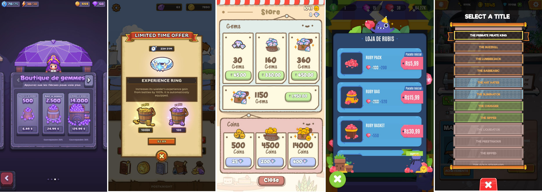
Some examples of mobile games that placed the closing button at the bottom, with our own implementation at the end of the list.
Theoretically, it made sense since a close button located at the bottom of the screen is more accessible to players using only one hand, as shown on the graphic below.
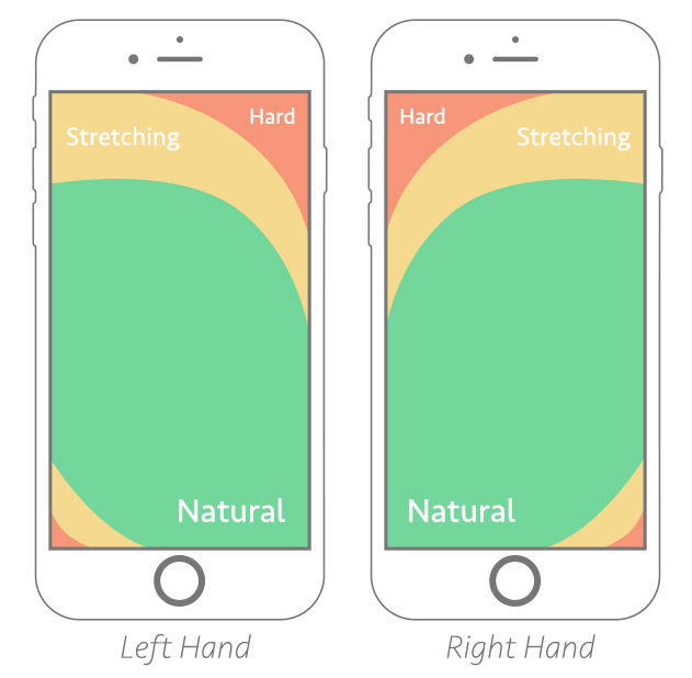
Image source : https://www.smashingmagazine.com/2016/09/the-thumb-zone-designing-for-mobile-users/
After spotting the trend, we did some research as well as in-house user tests to see if it was actually user-friendly, and then we applied it in our game. As you can see, even if we hadn’t already started designing the game’s user experience, we were still using user testing to validate concepts that eventually would make their way into the game. It also shows you don’t need to invest in a complex user testing process that usually involves a lot of time and money. Adjusting the testing methodology in a high-velocity project is important.
Teamwork & Communication
At BKOM Studios, multidisciplinary teamwork is the cornerstone of our DNA. Working together, we exchange ideas and ensure we all have the same understanding of the game’s mechanics. We flag details that were not thought of beforehand, and the UX role in the team is to make sure we’re thinking of the players at all times.
This communication flow helps us sort out specific items that could eventually become friction points. It also pushes the team to test them, against ideas that should resolve these experience gates.
One example of a challenge we ran into was the decision of the square size of the inventory’s grid — an element we had already spotted as the most important one within the game’s interface. While Overloot is a visually stunning game — no false modesty here — we found out pretty quickly that the players’ attention was mostly directed towards the grid where they have to manage their inventory. We needed to be sure of the optimal size for these squares. With a grid that contains bigger squares, the players would Overloot (fill up the inventory) too easily. On another other hand, with a grid with more but smaller squares, players would have a hard time tapping on isolated boxes of the grid to select/move items. As a result, it would be harder to distinguish the more similar items.
We decided to test three possible versions of the grid. We created interactive prototypes for each of them, and ran tests with users coming from various age groups. The result is the grid size that we see today in the game!
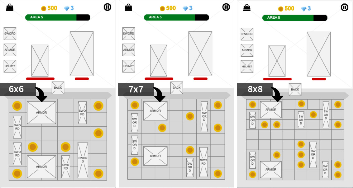
Screenshots of the three prototypes we developed to help us find the optimal grid size
Iterate, test, repeat
Games change a lot during production: the team spots problems or opportunities and brainstorm ways to make it better. This eventually leads to changes in the game, and the UX Team, acting as a guardian of the user experience, has to keep an eye on how to make changes that actually enhance the experience, and not harm it.
As soon as we have a playable version of the game, we can begin testing it with players, checking their reactions, flagging issues to the rest of the team and proposing optimizations.
The more we test and iterate, the better the player reception is. When a gameplay or an artistic aspect of the game is awesome, we get amazing feedback. However, as UX team, we know we’ve achieved success when nobody talks about it. We then know that the game doesn’t have any friction points for the user UX-wise.
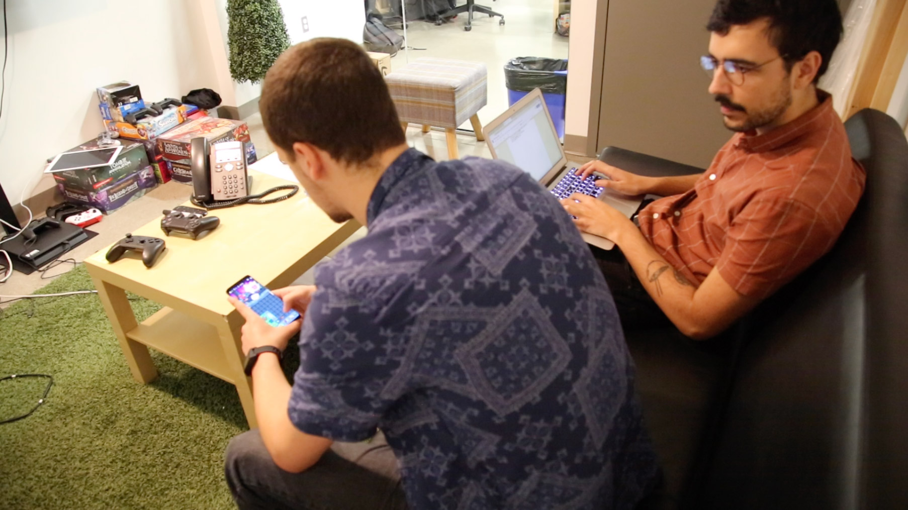
The testers were chosen based on the game’s target audiences, and each session involved a lot of note-taking.
Life after Launch
Even though the game is already available for Android and iOS, it’s not the end of the road for us. Our goal is to keep making the Overloot’s experience even better with feedback gathered from players now who found and downloaded the game on their phones in a more spontaneous way — this brings a new set of challenges we’re eager to face here in our UX Team.
Give Overloot a try (iOS, Android)!
Interested to be part of our team and help create games like Overloot? Check out our career opportunities!